Udāna — L'Embarquement
The launch-event website for Udāna, an organization building entrepreneurial and human connections between Canada and the Maghreb, starting with Morocco. Designed and developed by Asma Aouari Studio and live at udana.ca.
- Client
- Udāna
- Project
- Event landing page
- Year
- 2026
- Status
- Live at udana.ca
- Language
- French (Canada)
- Our role
- UX/UI design within the brand charter, front-end development, SEO, deployment
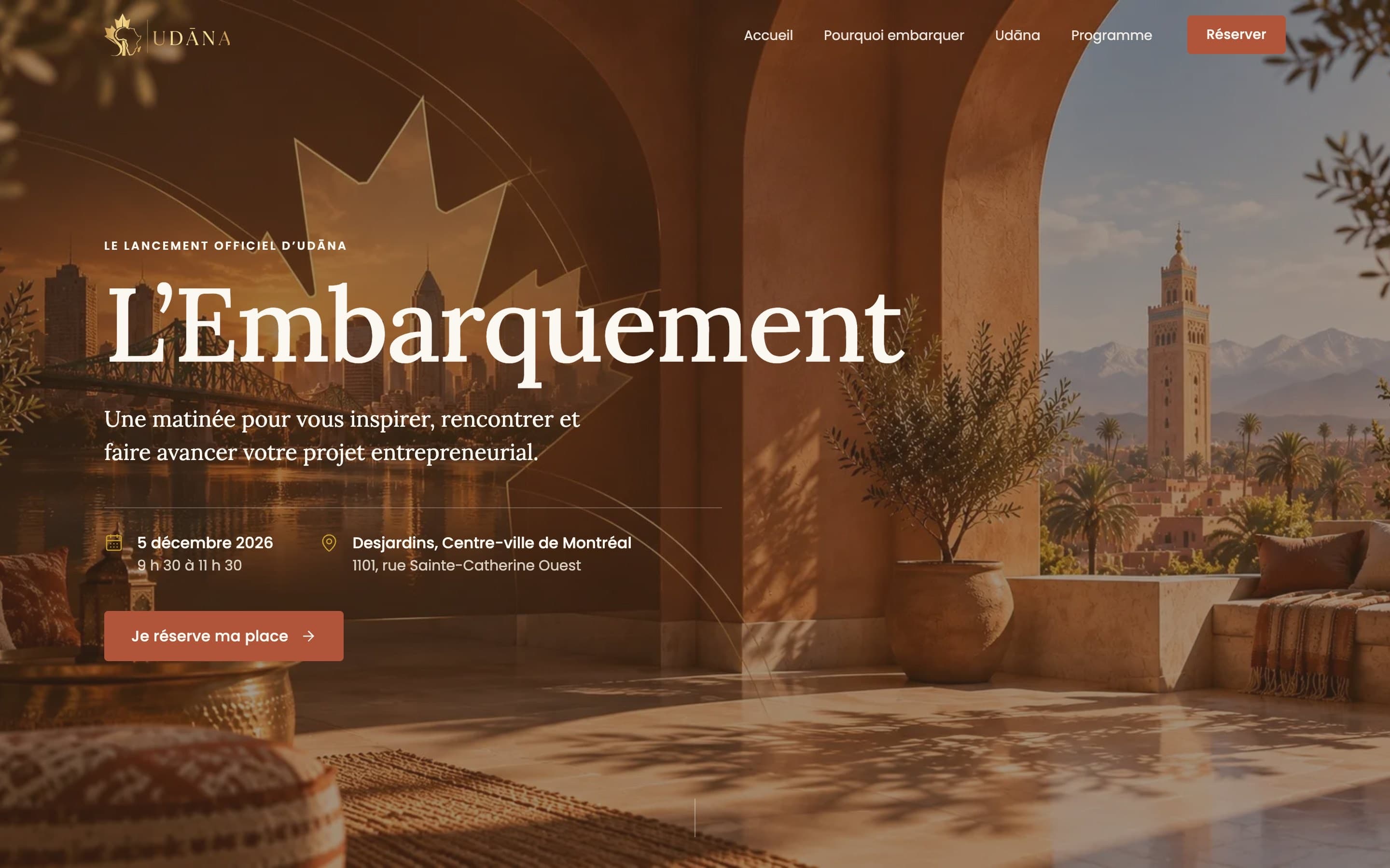
The brief
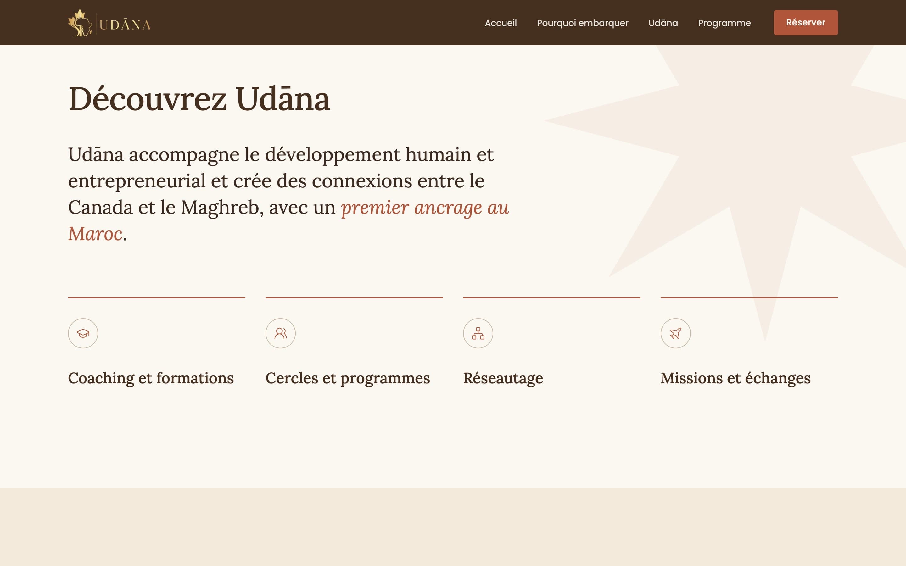
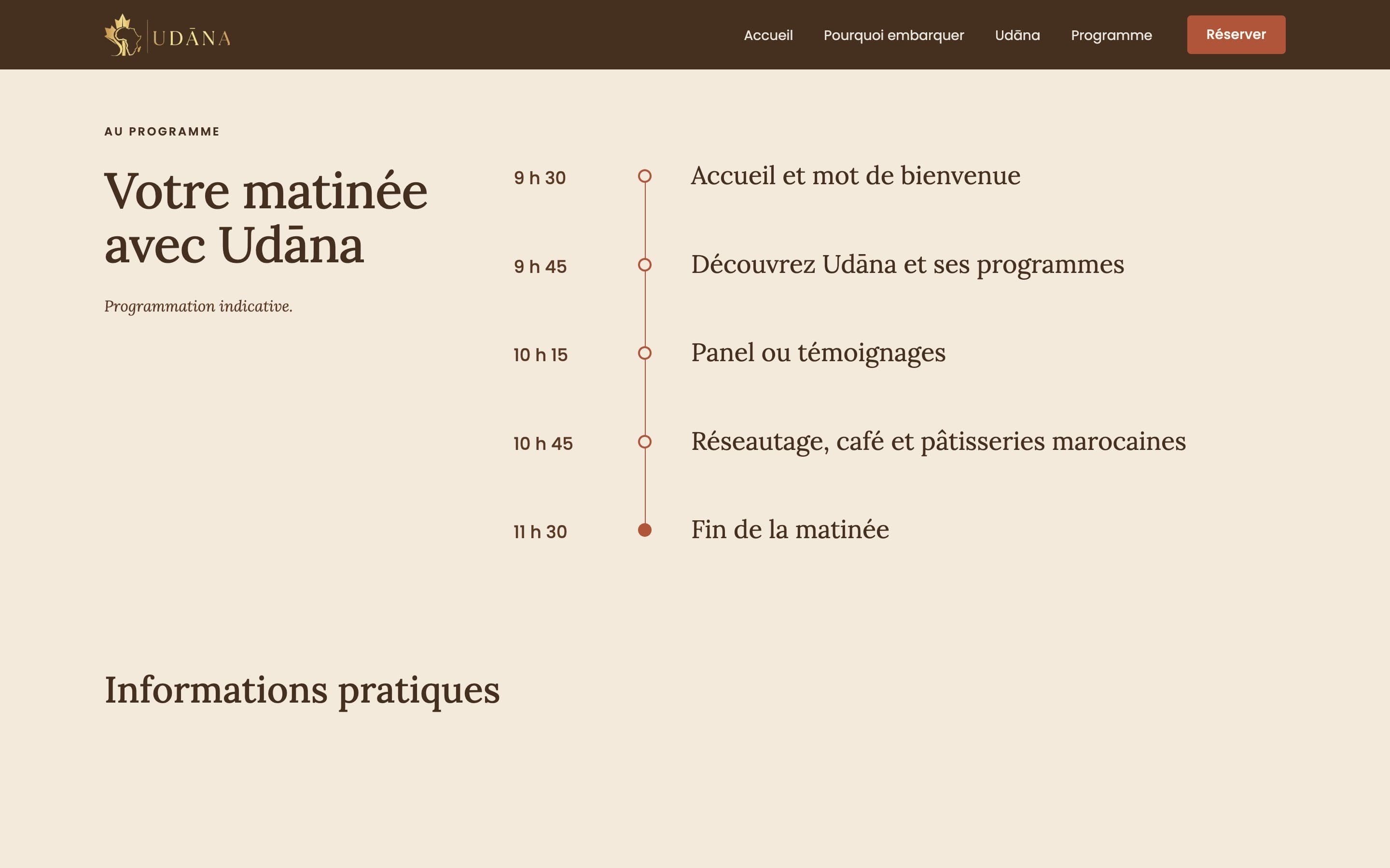
Udāna needed one clear page to announce L'Embarquement, its launch morning in downtown Montréal on 5 December 2026, and to send visitors to registration. The page had to explain who the event is for, introduce Udāna's programs and give attendees everything practical: date, time, venue, room, price, map and public-transit directions. Ticketing stays on the client's existing Zeffy page, so the site itself has no forms, accounts or payments to maintain.
Creative direction
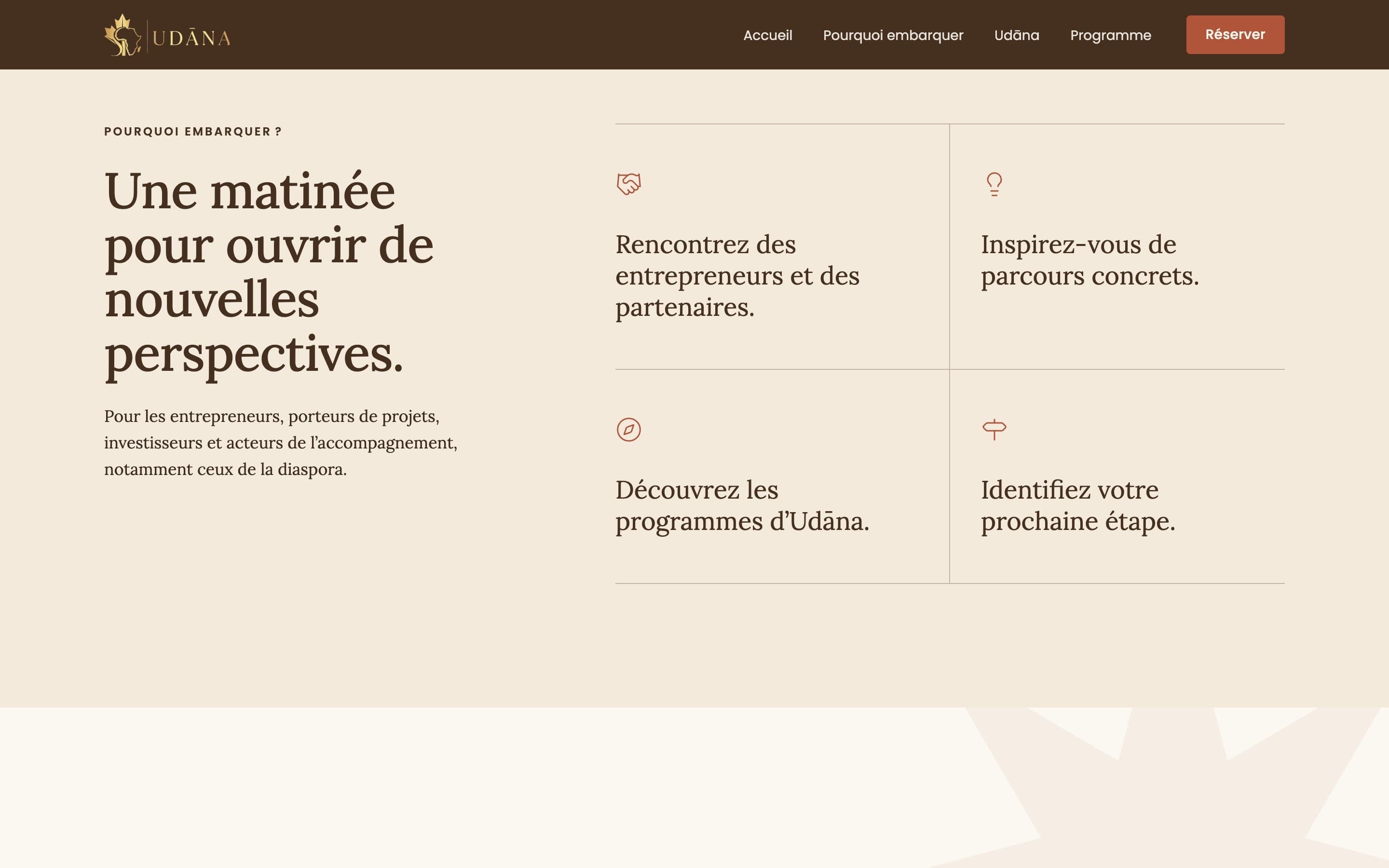
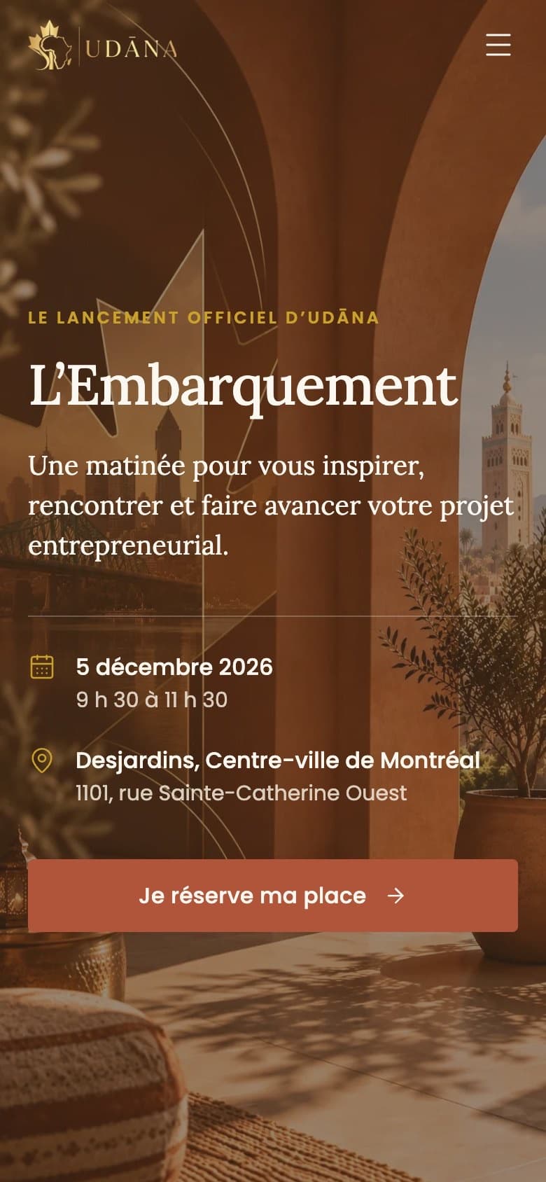
We worked strictly inside Udāna's graphic charter: a closed palette of deep brown, terracotta, gold and ivory, Lora for editorial headlines and Poppins for labels, no gradients, no drop shadows, and the charter's eight-point star used only as a quiet background motif at low opacity. The hero image joins the Montréal skyline and a Moroccan courtyard in a single view, so the Canada–Morocco story reads before any text does.
Brand system as built
- Palette
- Brown#45301F
- Terracotta#B0553A
- Gold#C9A227
- Ivory#F3EADC
- Olive#6E7350
- Typography
- LoraDisplay / Editorial
- PoppinsUI / Labels
- Built with
- Next.js
- TypeScript
- Tailwind CSS
- next/font
- JSON-LD
- Netlify
UX approach
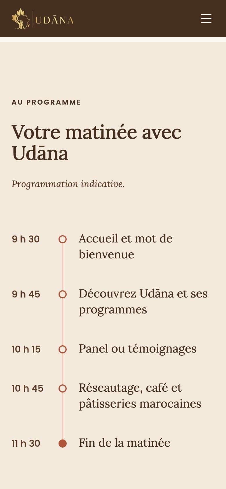
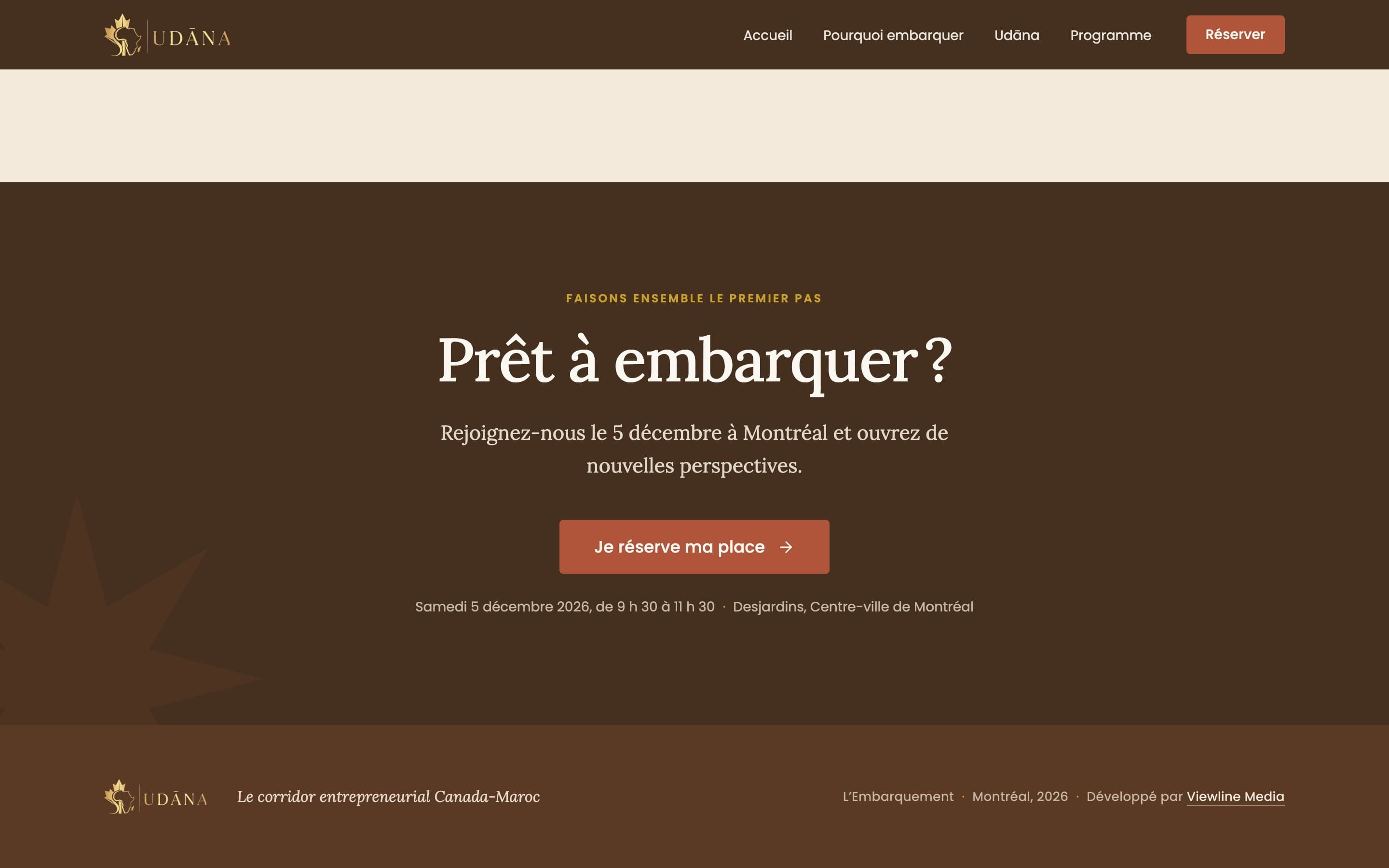
A single scroll answers the visitor's questions in the order they come up: what is it, why should I attend, who is Udāna, what happens that morning and how do I get there. The reservation link appears in the header, the hero, the mobile menu and the closing section, all driven by one constant in the code so it can never drift. Practical details sit together in one block next to an embedded map and a directions link.
Responsive strategy
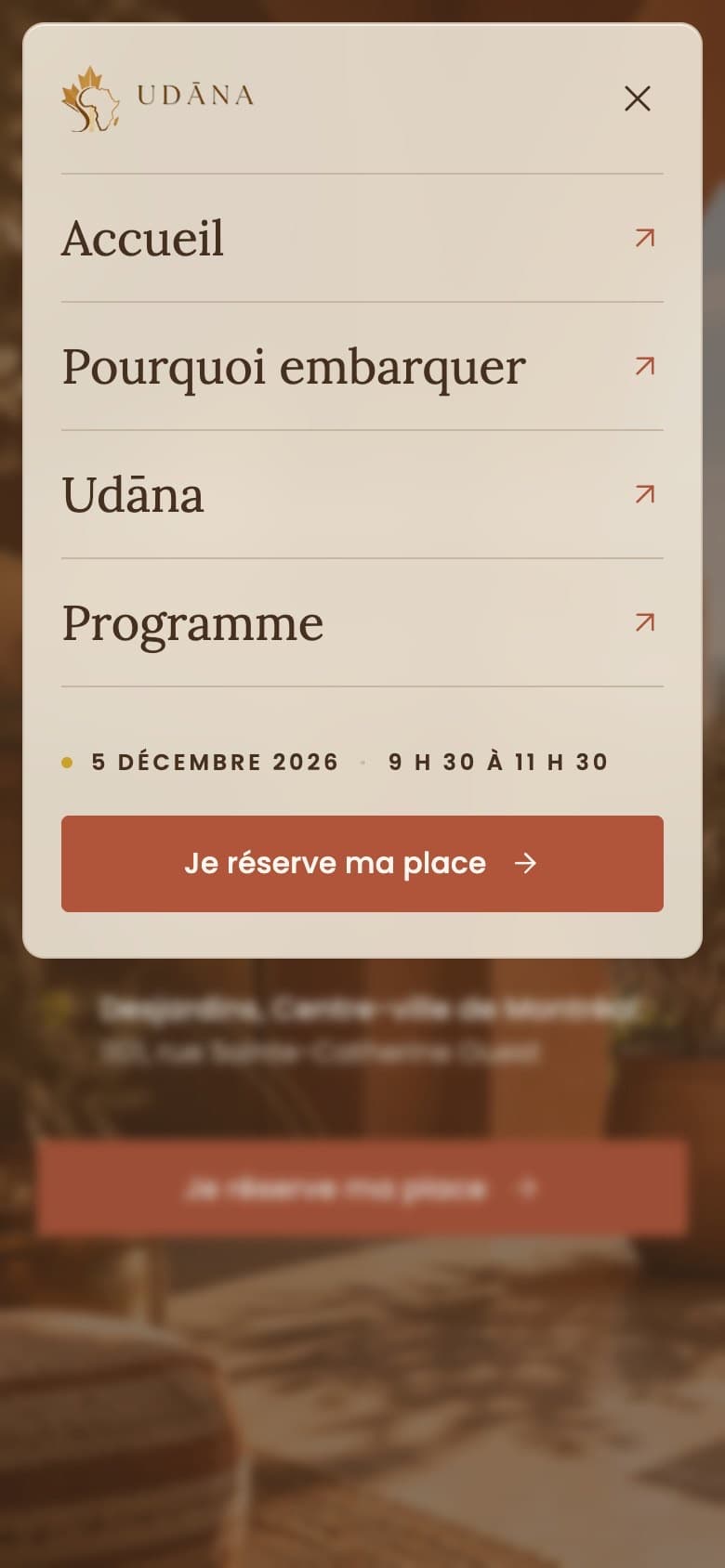
Mobile was art-directed rather than simply stacked. Phones and portrait tablets receive a dedicated portrait crop of the hero so both landmarks stay in frame. The mobile menu is a translucent ivory panel with a soft backdrop blur, a staggered entrance and a full keyboard focus trap, with a solid fallback for browsers or visitors that reduce transparency.
Motion & interaction
Motion is deliberately restrained. Sections fade up as they enter the viewport using CSS and an IntersectionObserver rather than an animation library, and every word stays visible without JavaScript. Buttons lift slightly on hover and deepen on press. All movement is switched off under prefers-reduced-motion.
Performance & accessibility
The hero image loads eagerly with high fetch priority, fonts are self-hosted with only the needed subset preloaded, and the map loads lazily. The markup uses real landmarks, a skip link, valid description lists for the event details, visible focus states and contrast-checked text over photography. During production QA we found that markup injected by the host broke React hydration on the live domain, and fixed it with a small inline cleanup so the page renders without client errors.
SEO & discoverability
The page ships with Event and Organization structured data (date, venue, price and ticket link), a canonical URL, Open Graph social previews, a sitemap and robots rules. Preview deployments are automatically marked noindex, so only udana.ca itself is meant to be indexed.
Planning a launch or an event?
We design and build custom event and brand websites from Montréal, in French and English.